A look behind triple j's rebrand at the ABC.
A little over a month ago, ABC youth brand triple j relaunched at its One Night Stand music festival. And it was a pretty big rebrand, touching the logo, typeface and general audio style of the station. A pretty big change is the new "J" audio sting that plays often on the station.

Gloss Australia reached out to the ABC for more details on the sonic rebrand, but didn't hear back. On the visual side of things, Howatson+Company, partnering with the ABC, has more info on the visual changes:
Since 1975, national broadcaster triple j has served as a lighthouse for young Australians, actively pushing culture forward and challenging norms through its disruptive programming, shows and events. Yet for the last 15 years, the brand and logo have remained static. To address this, triple j has partnered with Howatson+Company to reinvigorate the brand for today’s listeners.
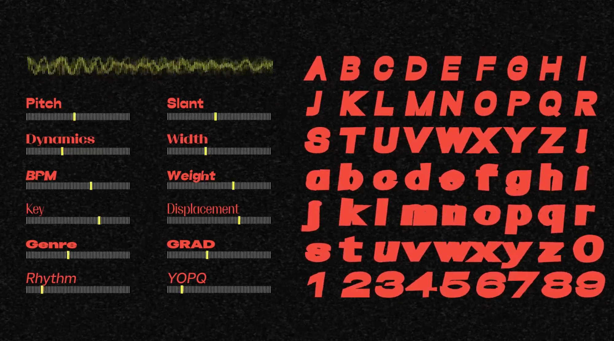
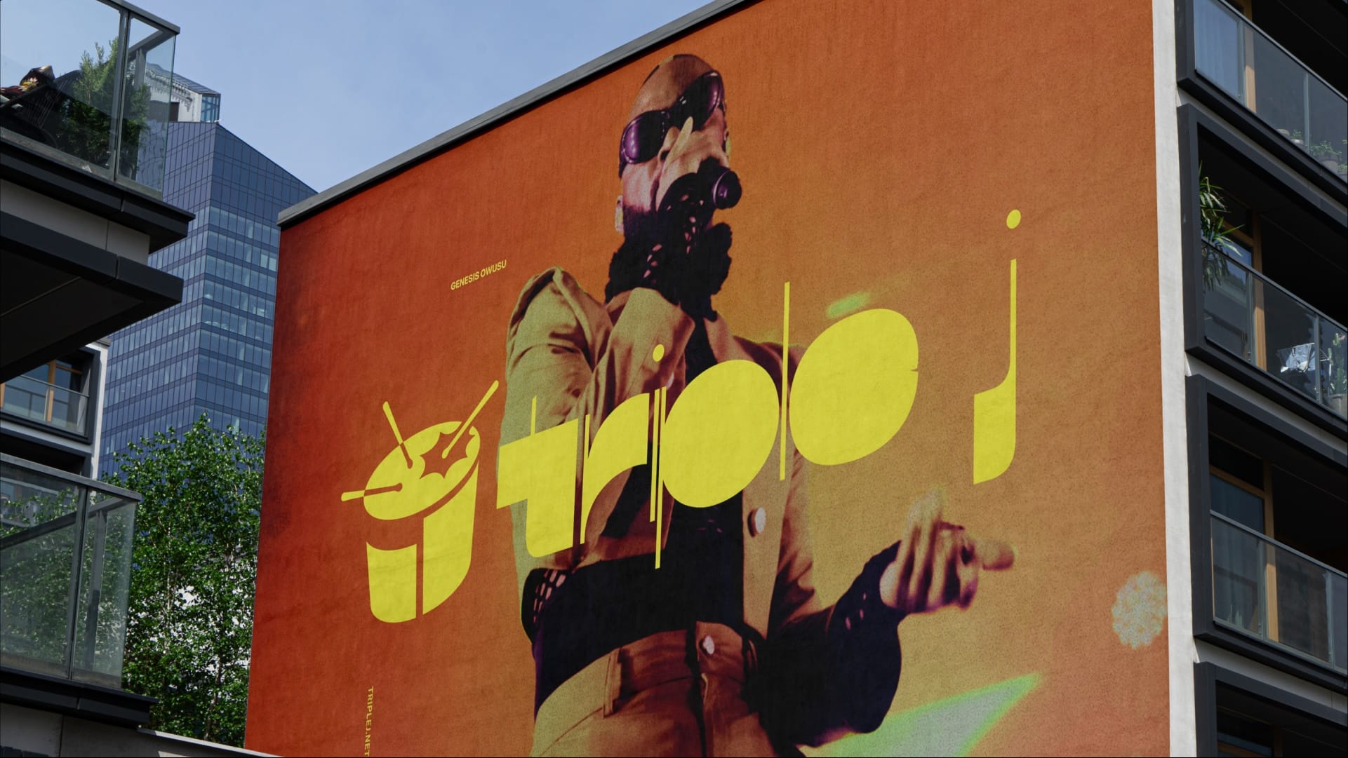
To make it, a custom variable typeface was designed that changes based on audio and musical inputs. The type was taught to respond to music and sound using algorithmic machine learning, creating a reactive design.

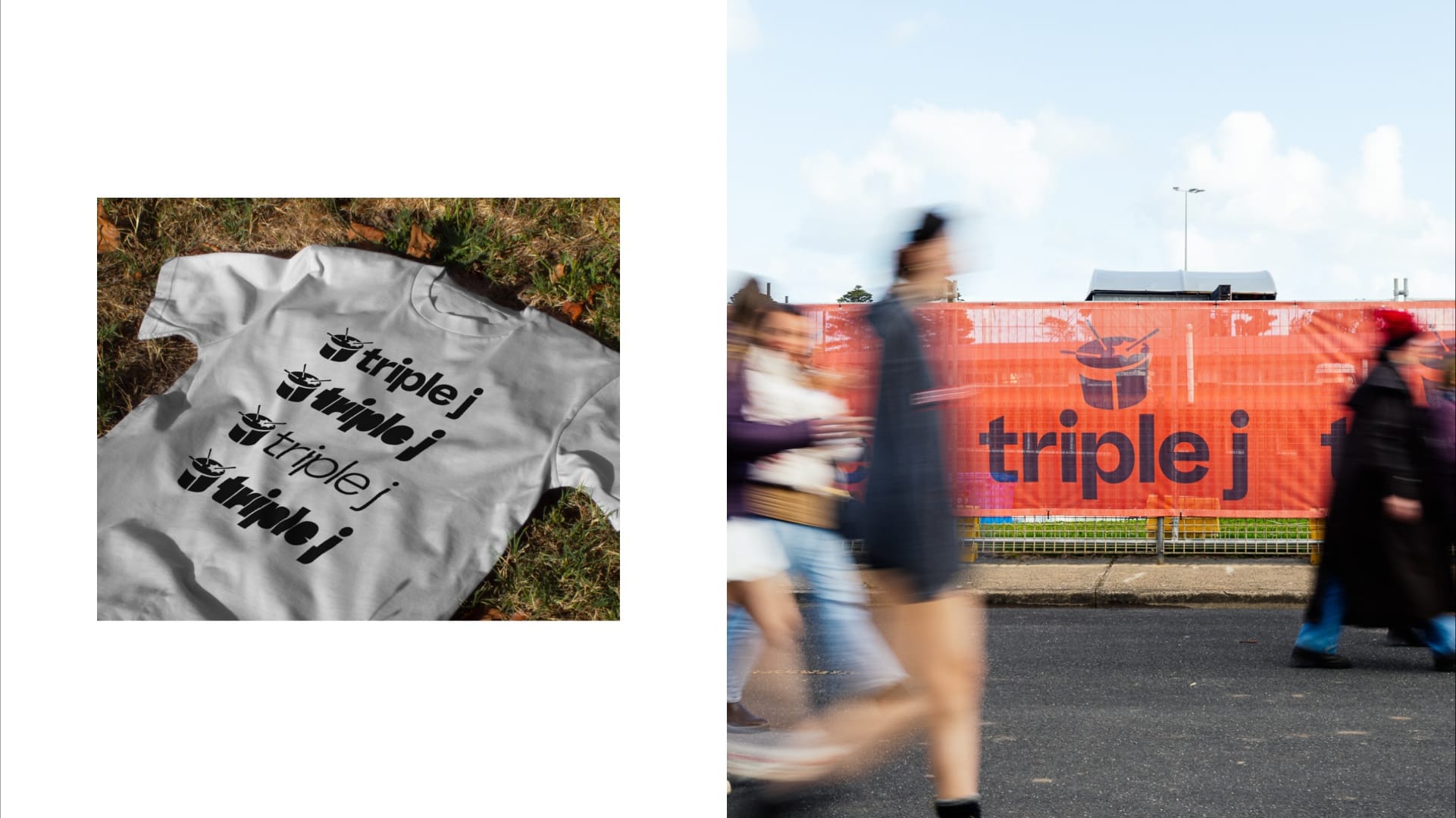
The brand’s most iconic element, the drum, was also updated to reflect the tastes of the station’s youth audience today, featuring a simplified base designed to reference digital soundbars and incorporate a hidden ‘j’.
The rebrand successfully refreshes triple j’s visual world while preserving its core identity as a champion of youth culture and new Australian music.


