
What makes this 90s CBS ID so specificlly 90s?

The YouTube algorithm fed me some good slop today in the form of US network CBS's 1997 fall campaign, weirdly pitched as "The Address Is CBS".
How can an address be a TV channel? Who knows.
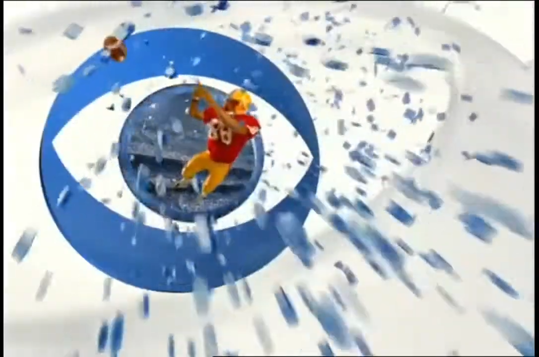
But watching it back, it is weird to see this and immediately know what era it's from. 1990's and early 2000's CGI and graphic design has such a specific look that I don't fully understand. And this video from YouTube has a smooth look that I don't fully understand either, even though it's only uploaded in 30fps.
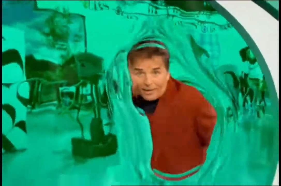
Is it interlacing or something? Did early CGI have a specific easing animation quality? And what did they put in that creepy yellow goop that Steve Urkel jumps into? Could we still do this kind of work, or is it a lost art form? The gradients, the swirling effects. It's almost like minimalism has left this in the past as a lost art.

Either way, ignore the YouTube thumbnail jumpscare, he's only in it for a few seconds.